Color choices for your family or group portrait
One of the most important decisions to make before coming to the studio for your family or group portrait is to decide what to wear!
The style is one thing you need to decide for yourself, you can choose casual, traditional, formal, based on what the portrait is for and what you are comfortable in.
The other important question is choosing the colors of what you wear. Unless it is going to be a black & white portrait, the color choices should be made consciously. You do not want to grab something in your closet without thinking about what your sibling, husband or parents are wearing. This could also be an opportunity to go shopping, which can be fun for a lot of us.
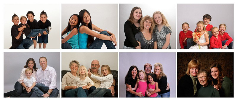
Normally you should wear colors which match in some way, not clashing, unless you are making a statement on purpose. There are well known color schemes for design, but what looks good in the paint of a room is not necessarily what you want to wear in a portrait. For portraits, choose colors which are similar or analogous, different shades of green, different blues, different reds, etc., take a look at the sample photos above, the colors do not clash. Black goes with anything, so you can always wear black with something else. I generally discourage everybody wearing the same white, it looks too uniform and less interesting than subtle shades of off-white, if white is what you want, go with slightly different whites for everyone. See the lower left two photos in the sample above. (If you wonder why the photo is so small, it is because I only want you to focus on the colors!)
Complementary colors are rarely what you want to wear in a portrait, think red and green, purple and yellow. Pretty in a Van Gough, but not usually recommended. It is not out of the question, but you have to be very intentional when you choose complementary colors.
I also like to see some textures in the clothing. Stitches, embroidery, ruffles, ribbons, different materials, mute prints (never loud patterns!) so in a close-up you have something interesting to rest your eyes at after you looked at the faces. But really, in a group portrait, we are interested in faces, body language which show how you relate to each other. Clothing is secondary and play a supporting role, they should not distract viewers.
This web site http://colorschemedesigner.com has some easy and fun ways you can look at color families, click on “mono”, “analogic” and “accented analogic” for good combination of colors that would look great in a group or family portrait. Don’t forget to look at my gallery for more examples of family portraits.
If you have any questions, call 831-426-1400 or email me any time to discuss your clothing choices.